When to Update an Old Logo
Learn when a logo refresh is enough, what to keep, what to change, and how to roll out the new look without confusing customers.
Key takeaways
- A refresh keeps what people already recognize about you—your name, color, and overall shape—and fixes what gets in the way.
- Refresh your logo if it disappears at small sizes, fails on dark backgrounds, or you only have an old low-quality image.
- A completely new logo makes sense when your business name or activity has changed, not just because you are bored of the design.
- Move customers over gradually: update accounts and your website first, then printed materials when they are due for reprinting.
Update your logo when it gets in the way of your business, not when you are simply tired of it. If it turns into a blur when reduced to a profile image, cannot be read on a dark background, or only exists as an old low-quality image, it needs work. And a refresh is not the same as a full replacement. A refresh keeps what people know you by—your name, color, and overall shape—and fixes the rest. That way, long-time customers do not feel like they are looking at a different store, and you get a logo that works everywhere you need it today.
Refresh or a brand-new logo?
| Situation | Best choice |
|---|---|
| Your customers know the logo, but it feels crowded or dated | Refresh |
| You do not have a vector file and the image is poor quality | Refresh and redraw it cleanly |
| The business name or activity has changed | New logo |
| The logo is copied or too similar to another brand | New logo |
| The business is only a few months old and nobody really knows it yet | Either is fine, since the cost to customers is small |
Five signs your logo needs a refresh
- It turns into an unclear blob when reduced to a profile picture or website icon.
- It has gradients, shadows, and fine details that do not show up in one-color printing or embroidery.
- There is no version for dark backgrounds.
- Its font is not available with a commercial license, or nobody knows what font it is.
- Every designer you worked with redrew it in their own way, so now you have five slightly different versions.
What stays and what changes
Ask two or three customers: what do you remember about our logo? Their answer is what should stay. Usually that means the color and a general shape or distinctive letter. Anything nobody mentions can usually be simplified.
- Usually stays: the main color or something very close to it, the overall idea of the symbol, and the way the name is written if it is distinctive.
- Usually changes: extra detail, shadows and gradients, the old font, and the proportions between the symbol and the name.
- Should be added: a short icon version, a one-color version, a version for dark backgrounds, and vector files.
What to prepare for the designer
- Your current logo files in the highest quality available, plus any old source files.
- Photos showing how it is used now: storefront, packaging, accounts, invoice.
- Exactly what bothers you about it, and what must not be changed.
- Where the new logo will appear first, and the smallest size it will be used at.
- Two examples of logo refreshes you liked.
Also ask to see the old and new logos side by side at a small size. That is where the real difference shows. On Hylance, at the time of writing, logo refresh services for an existing brand start at about SAR 120 (about $32), and the exact price is listed on the service page.
The rollout plan: what to replace, and in what order
- Start with what changes in one click: profile images, website and store icon, email signature, and post templates.
- Then move to documents: invoices, quotations, and presentations.
- Then update printed materials when they are reprinted: do not throw away your stock of boxes and cards; replace them when it runs out.
- Leave the expensive items until last: storefront sign, vehicles, and uniforms.
- Announce the change in a post that shows the old and new versions together, so nobody thinks the account belongs to someone else.
Common mistakes when refreshing a logo
- Changing the color, shape, and name all at once, so nothing links the new logo to the old one.
- Refreshing every year. A logo needs years to stick in people’s minds.
- Chasing a passing trend that will look old in two years.
- Using the old and new versions together for too long without a plan.
- Accepting only an image file without vector files, so the same problem comes back again.
A good refresh is something most customers barely notice; they just feel that the brand looks clearer. If you order it on Hylance, write in your order message what should stay, what should change, and which files you expect to receive. Your payment stays on hold until you receive them and confirm.
Example: a bakery that has been around for ten years
A well-known neighborhood bakery has a logo with a detailed drawing of a wheat stalk, an oven, and a ribbon carrying the name in an ornate script, in brown and gold gradients. It looks fine on the storefront sign, but in an Instagram profile picture nothing is readable, and on paper bags it prints as a dark blotch.
- What customers said when asked: “the wheat stalk and the brown color.”
- What stayed: the wheat stalk, simplified into a few lines, and the same brown without the gradient.
- What changed: the oven and ribbon were removed, and the name was set in a clear bold typeface.
- What was added: an icon using only the wheat stalk for the profile image, and a one-color version for the bags.
- The rollout: accounts and the digital menu within a week, bags with the next print order, and the sign after a year.
This example is hypothetical and meant to explain the idea. The result is that existing customers still see the same bakery, new customers see a tidy brand, and the bakery owner did not throw away a single bag.
Questions to ask yourself before ordering
- What problem am I trying to solve exactly: readability, printing, or an outdated look?
- Has anything changed in the business or audience, or is it only the look?
- How much will replacing printed materials and signs cost me, and when will that happen?
- Who approves the final design? One person is better than a committee.
Logo refresh services and what comes after
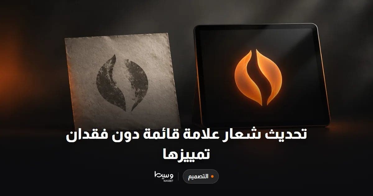
Logo Update Without Losing Brand Recognition
- Graphics & Design
- New service

Logo, Colors, and Fonts Mini Brand Identity
- Graphics & Design
- New service
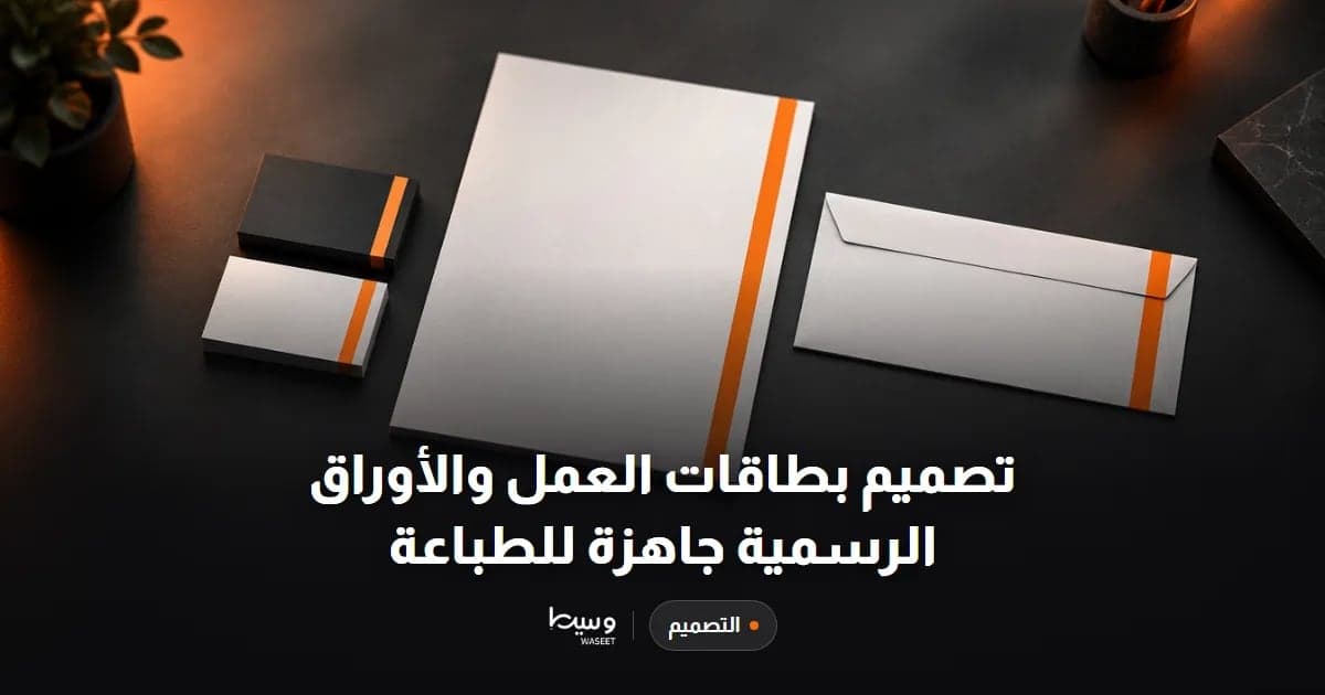
Business Card and Stationery Design Ready for Print
- Graphics & Design
- New service
Frequently asked questions
What is the difference between a logo refresh and a new logo design?
A refresh keeps the elements people already recognize, such as the name, color, and overall shape, while simplifying details and fixing usability problems. A new logo starts from scratch and fits a change in name, business activity, or audience.
Will I lose customers if I change my logo?
Not if you keep the parts they recognize and announce the change. The real risk is changing everything at once without warning, which can make customers think the account or store is not yours.
What should I send a designer to refresh my logo?
Send your current logo files in the best quality you have, examples of where it is used, exactly what bothers you about it, what must not change, and where the new logo will appear first.
Ready to put this into practice?
Browse Graphics & Design services on Hylance and order what your business needs, with escrow that protects both sides. Or create an account and list your first service in minutes.